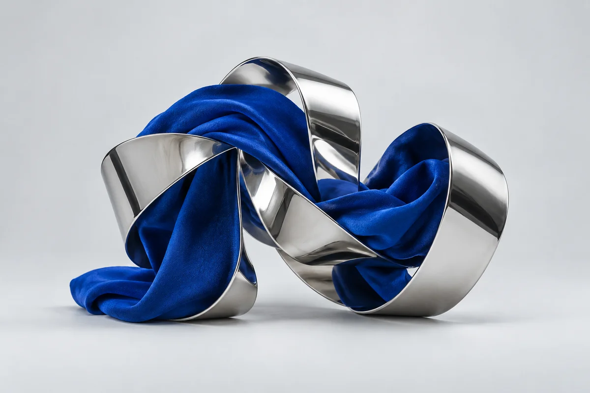
An existing ALTERHALF studio image that pairs soft cobalt fabric with a polished chrome ribbon. A starting point for exploring contrast in a visual identity.
The idea
See how two contrasting materials can belong in the same composition. The fabric brings movement and a strong colour; the chrome catches the light and adds sharper edges.
Design choices
Keep the palette small so the material contrast stays clear.
Leave enough space for type rather than asking the image to explain everything.
Try the same direction across a cover, a page and a smaller graphic to see what holds together.
Where it goes next
This can become a fuller identity study with a logo, typography, colour rules and a small set of applications. For now, it is studio material rather than a client case study.